
COLOUR AS CURRENCY
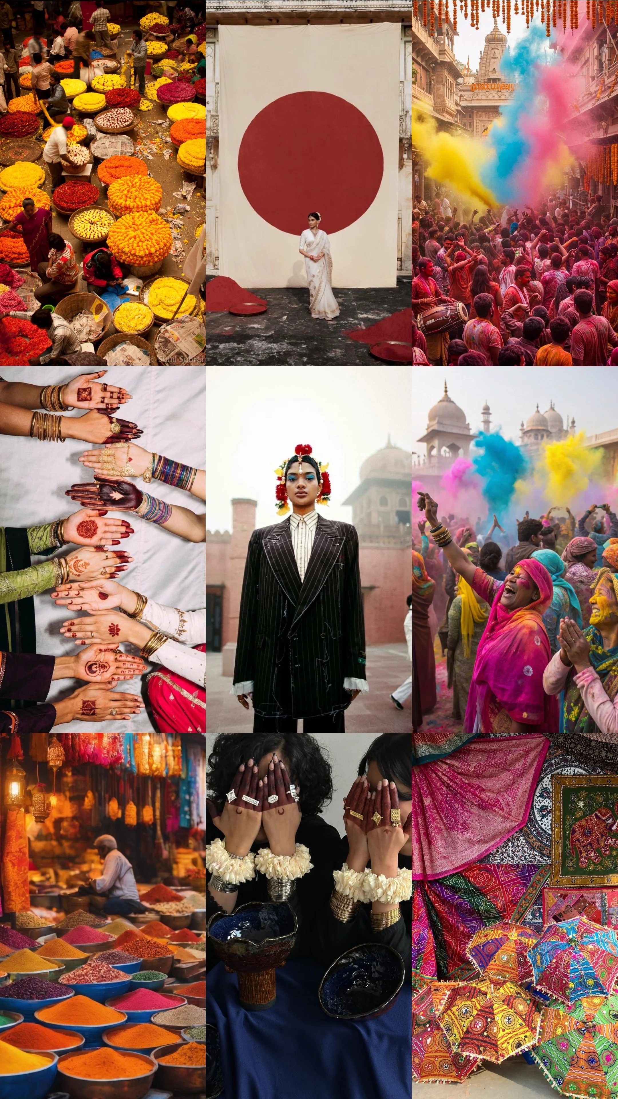
Walk through any Indian street during Holi and you’ll understand instantly: colour here isn’t decorative, it’s everything. It stains the air, clings to the skin, transforms strangers into friends. In India, colour is a social equalizer, a cultural code, and a form of currency. It signals joy, prosperity, spirituality, and aspiration sometimes all at once.
The emotional weight of colour
Every shade carries meaning. Red is a bride’s power. Saffron signals faith. Gold whispers prosperity. Even white, often seen as neutral in the West, carries cultural weight in India as a symbol of mourning. Colour isn’t chosen casually here it’s woven into identity, ritual, and memory.
This is why Indian consumers respond so differently to design than Western ones. Where Western luxury often leans on restraint and minimal palettes, Indian aspiration is expressed through saturation. For us, richness feels inviting. Maximalism signals abundance. Restraint, more often than not, reads as emptiness.
My experience with colour in campaigns
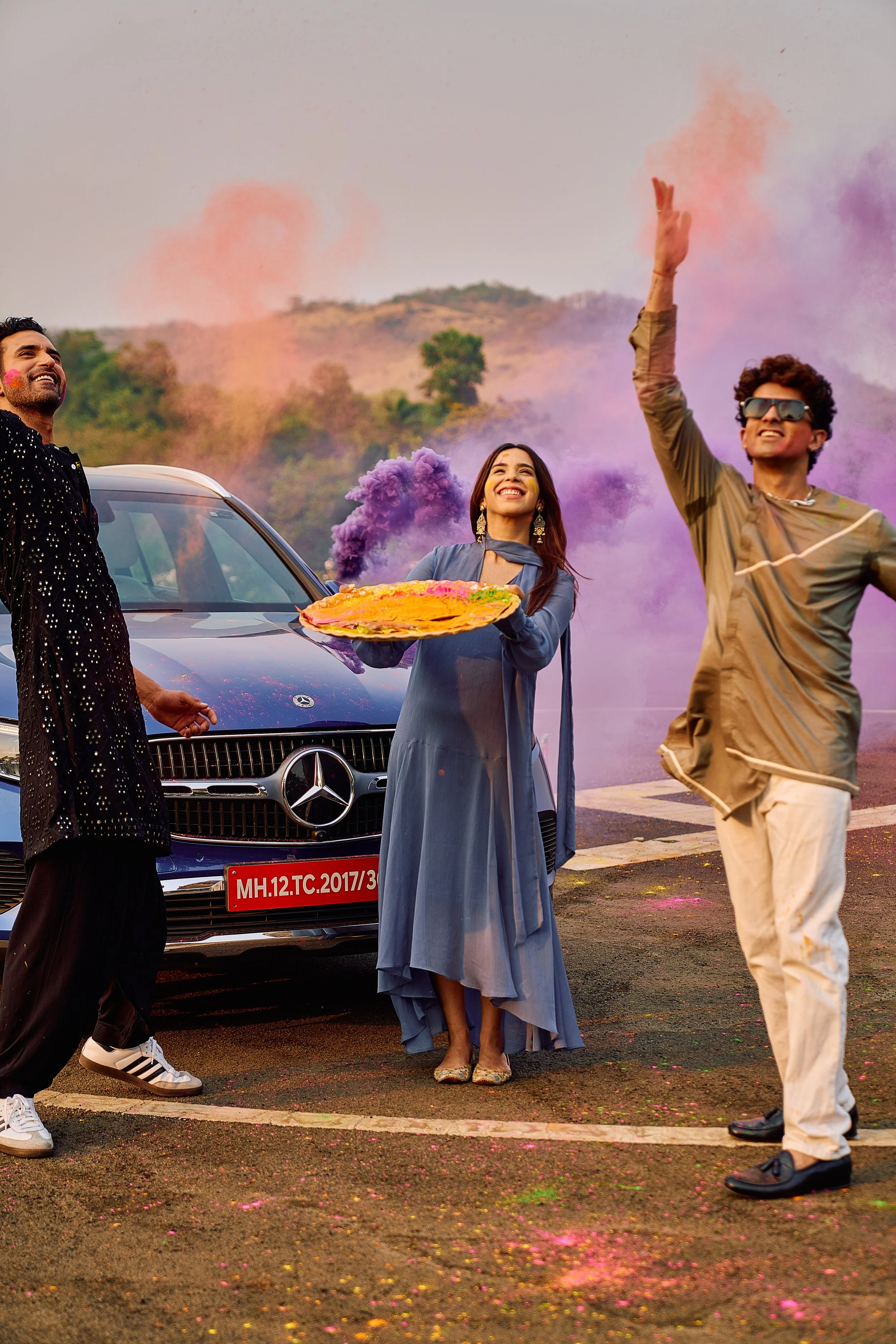
When I worked on the Mercedes-Benz Holi campaign, the tension was obvious: how do you place a sleek, monochrome luxury brand inside the chaotic vibrancy of Holi without diluting its essence? The answer was to embrace the contrast. We let the car’s clean lines sit unapologetically against bursts of powder, showing how precision engineering could coexist with cultural exuberance. The result was a campaign that positioned Mercedes not as distant luxury, but as emotionally present.
That project cemented what I already practice as a designer: leaning unapologetically into colour. My interiors thrive on maximal palettes rust orange velvets, deep burgundy walls, jewel-toned accents because I know colour in India isn’t background. It’s the main act.
What brands need to understand
Many global brands make the mistake of muting their colour stories for the Indian market, thinking restraint equals sophistication. But here, colour is sophistication. It’s how aspiration is signaled. Indian Gen Z, especially, embraces bold palettes as identity markers: neon greens in streetwear, metallics in beauty, jewel tones in interiors. They’re not afraid of saturation they thrive in it.
Colour also drives retail cycles. Festivals dictate palettes: Diwali brings gold and crimson into play, Holi explodes with neons, Eid spotlights emeralds and silvers. A brand that syncs its aesthetic with this rhythm doesn’t just look good it feels relevant.
The takeaway
In India, colour is more than visual. It’s symbolic. It’s emotional. It’s currency. Brands that approach it as ‘decoration’ will always fall short, while those who understand its cultural weight unlock a deeper, more resonant connection.
For me as a designer, colour isn’t just a tool. It’s the language I work in. Because in India, you can strip away almost everything but never the colour.