I designed my first project before I went to design school. YES, that’s right.
But I did spend a decade obsessing over silhouettes, textures, and the perfect shade of off-white and I’ve always known that if you can dress a body, you can dress a room. This home was my proof of concept. Fashion was my only design vocabulary when I began and it taught me everything from colour palettes, to mixing print and patterns to textures.
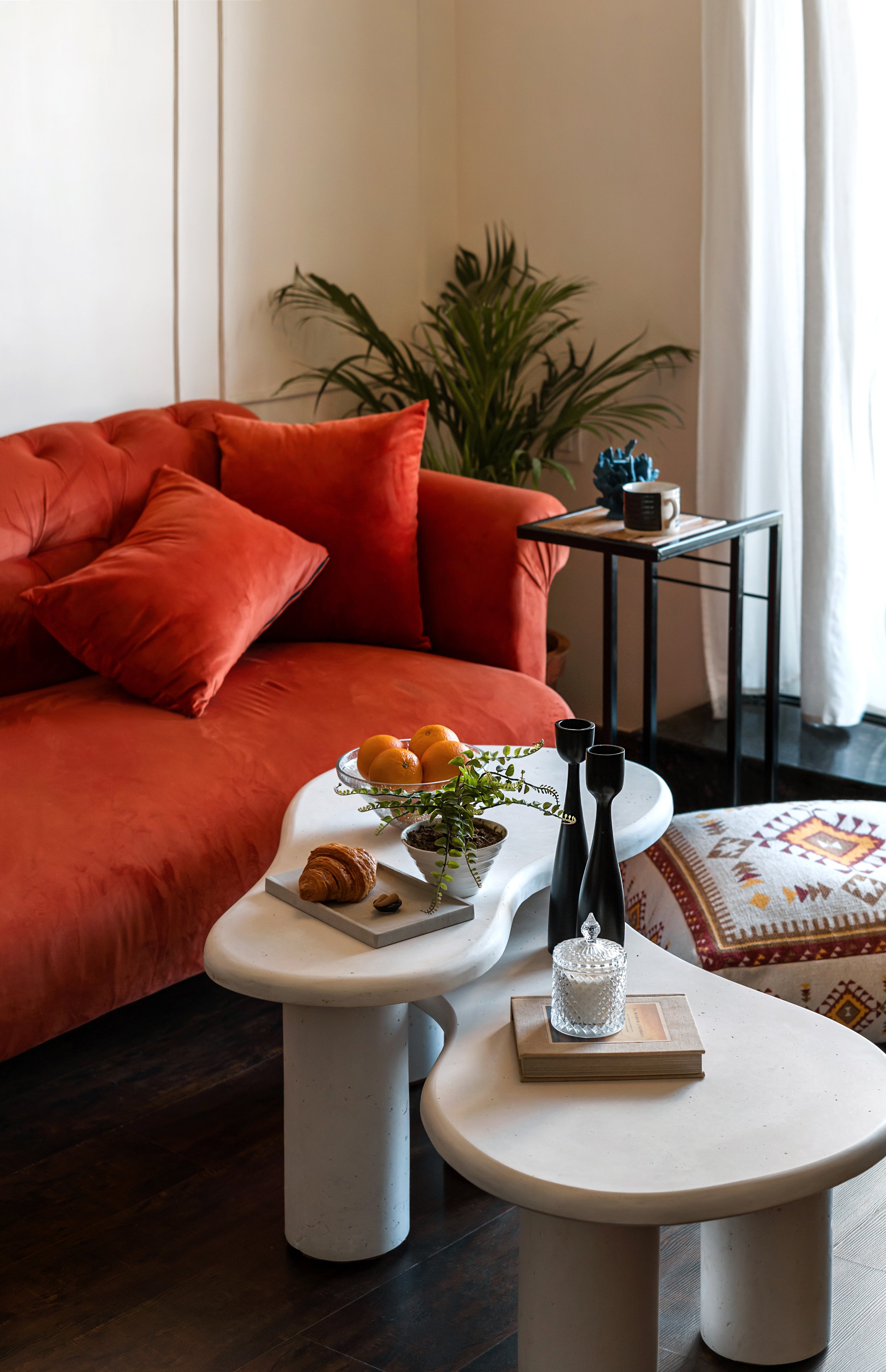
A Fashion Floorplay
Residential design 1Location: Mumbai, IndiaDesign style: Modern Victorian, MaximalismRole: Concept, Design, Styling, Sourcing, Execution
Concept:
The brief was Modern Victorian so I decided to go vintage chic. Elements from Victorian era like mouldings, rich hues, florals but with an industrial twist such as metal, abstract wallpapers, black accents. Basically a fashion girly meets New York loft meets Victorian countryside.
Process:
I didn’t draft technical elevations. I built a space the way I build outfits:
•I started with a hero piece (like the orange couch *hint: she was a Friend’s fan’)
I started with colour palettes and fabrics, my strengths and then decided the materials I want to work with.
My mood board wasn’t pretty Pinterest images, it was my fashion styling images, outfits I wore against my vacation backdrops and design elements I saw in Jane Austen movies on Netflix.
Takeaway:
Designing this home taught me that having no formal training wasn’t a flaw, it was freedom. I wasn’t boxed in by rules but driven by instinct. It also was the first time I was on site working with contractor teams, the practical experience before diving into studying theory was immensely helpful.

A NEUTRAL BLUEPRINT
Residential design 2Location: Mumbai , IndiaDesign style: Scandinavian with warm neutrals and sculptural anchorsRole:Full Interior Design, concept, styling, sourcing, execution, photography.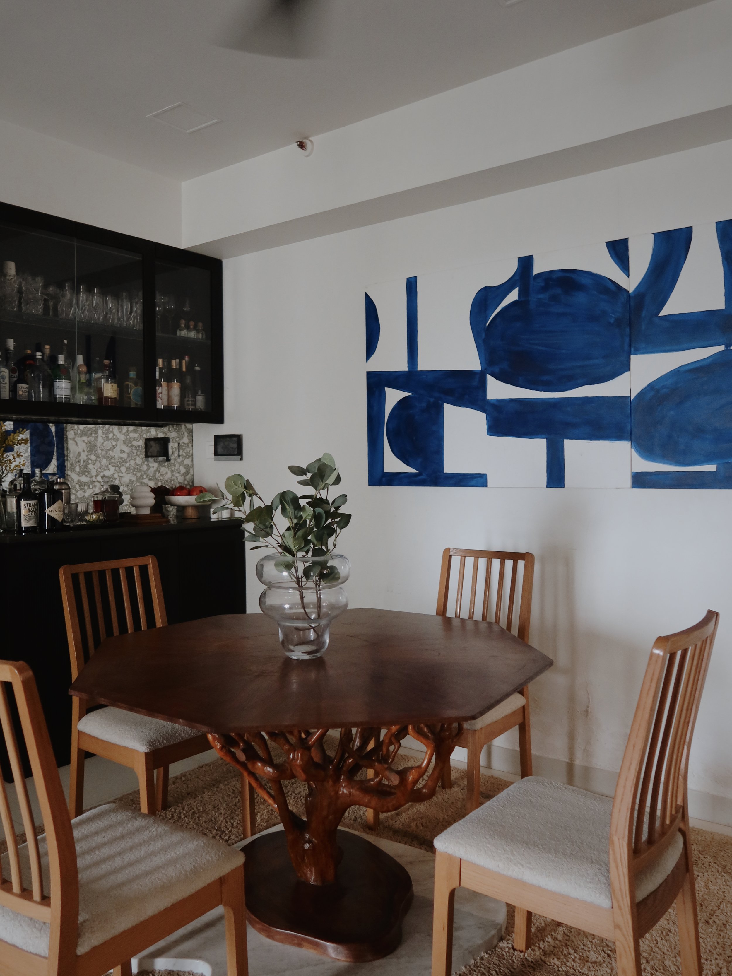

Concept:
I had to create a functional yet elevated space for a young couple with an eye for aesthetics. My client was very adamant on an all white space but the maximalist in me felt challenged so I made her a deal, well keep your dreamy whites but let’s give them something it flirt with. Since she wanted a calm space, BLUE was my first instinct and this rich shade of blue added luxe to the space. Oh, and it was my first project to design for pets.
Process:
We wanted the space to be modern yet emotional through materiality. Rooted in nature and culture, the stand for the dining table is actually a branch from her hometown Assam in India, a keepsake she brought along to the big city to stay close to her roots. We used the branch to design a sculptural base for the dining table.
The vision was to bring out the dark accents on clean walls to give the space depth and luxe yet make it feel calm.
For styling I used bold hues, natural wood and rich fabrics with minimal furniture pieces to create silent drama in the space.
Takeaway:
This project is rooted in the idea that modern interiors don’t need to be sterile or hyper-polished. Organic meets geometric. Comfort meets conversation piece. Every item was chosen not just for function or style, but for the feeling it evokes. This home pushed me to design emotionally. To edit without losing richness. To think of interiors as quiet storytellers, not just spaces.


The Plaid Pantry
I designed this kitchen as an homage to slow living in one of the busiest cities in the world. Drawing from farmhouse nostalgia but with a fresh twist, the space blends rustic character with contemporary utility. Think Little Women but modern.

Type: Residential Kitchen renovationLocation: Mumbai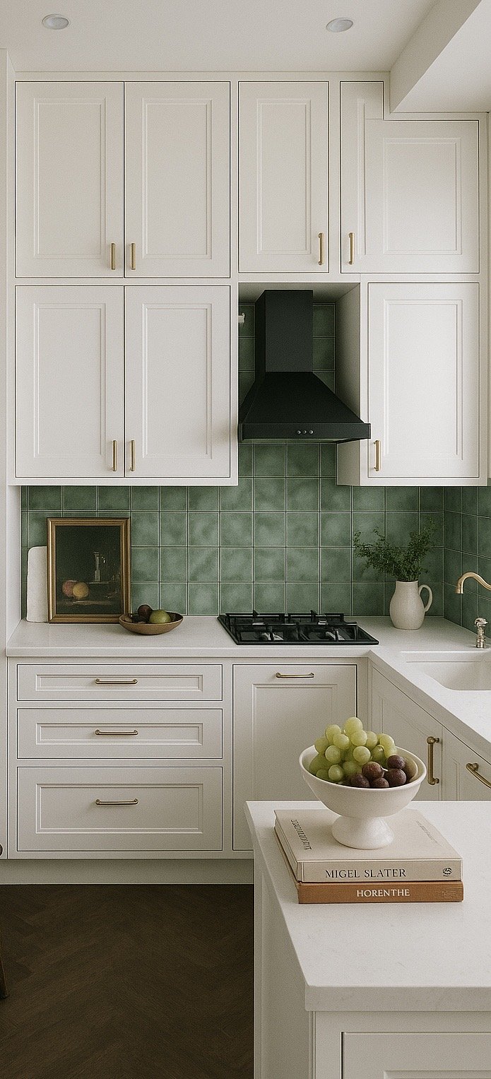
Material and Moodboard highlights:
• Green plaid wallpaper sets the tone with a playful, pattern-rich backdrop — a bold yet warm nod to vintage kitchens.
• White cabinets with classic mouldings add structure, softness, and a sense of timelessness.
• Deep green backsplash tiles provide rich contrast and tie the palette together with a sense of depth and sophistication.
• Rustic wooden chair and cane accents bring texture and warmth, grounding the space in its farmhouse roots.
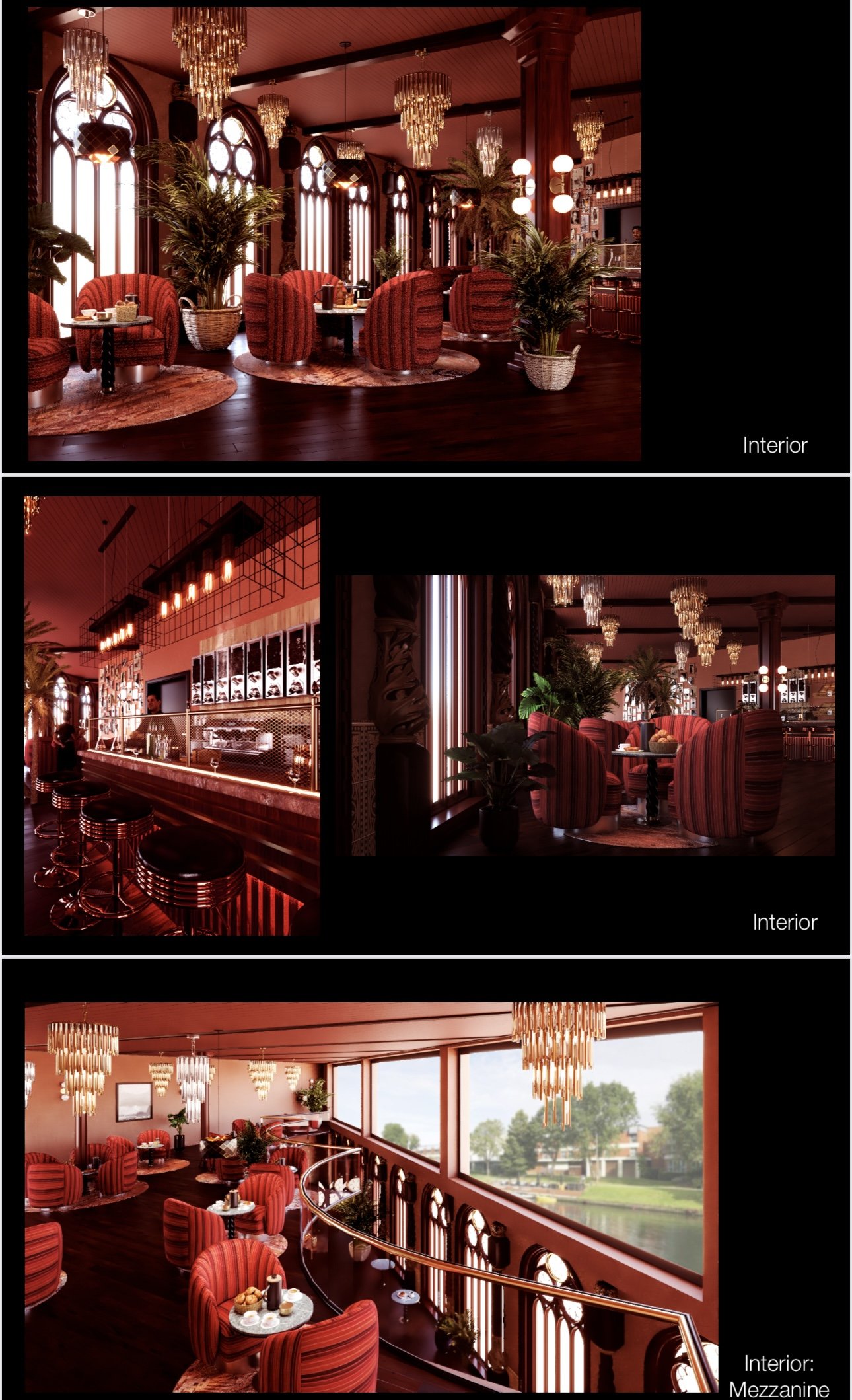
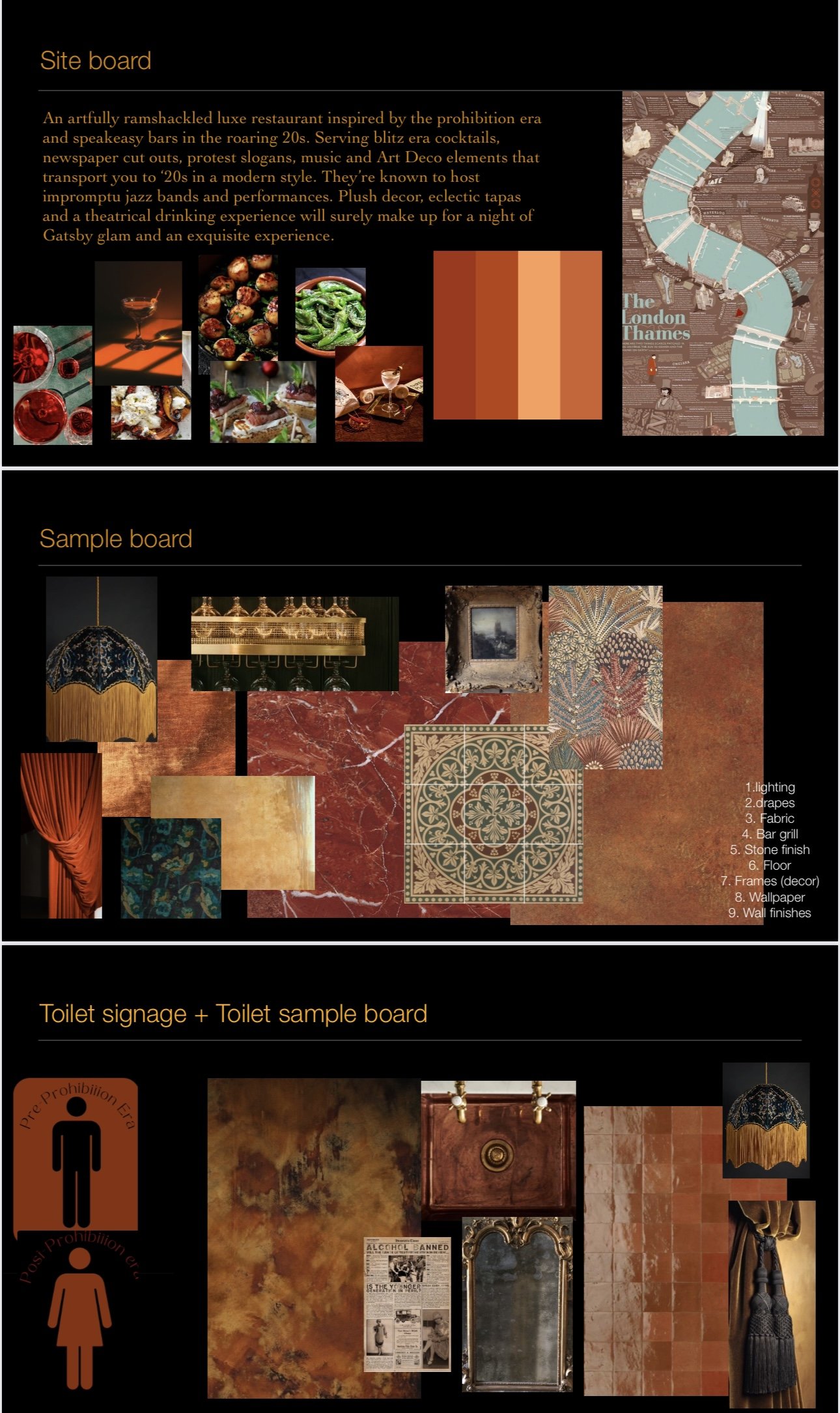
Welcome to my final project at Chelsea college of design for retail and commercial design, and full-throttle love letter to maximalism, storytelling, and scandalous luxury. Set along the moody banks of the Thames, I created an artfully ramshackled luxe restaurant inspired by the prohibition era and speakeasy bars in the roaring 20s. It’s filled with odds and ends, serving blitz era cocktails, newspaper cut outs, protest slogans, music and Art Deco elements that transport you to ‘20s in a modern style.
In my head, they’re known to host impromptu jazz bands and war time sing along. Plush decor, eclectic tapas and a theatrical drinking experience.
The DECO
It was my first time designing a retail space, the nervousness was real. From understanding service tables to dumbwaiter, this was truly a big learning curve. The idea was to show my understanding of design which is to craft an immersive experience that feels equal parts cinematic and intimate. This wasn’t just about creating a place to eat or drink; it was about designing a scene, a secret, a vibe. It’s the kind of project that taught me to trust my instincts, push beyond clean Pinterest palettes, and most importantly: if you’re going to do maximalism, you commit.
It also made me realise that design softwares were going to be my biggest enemy in my design journey. My renders might be basic but my ideas went beyond.
Process